
OpenOffice.org Off the Wall: Fonts of Wisdom
The selection of fonts is central to document design. Knowing how to choose fonts not only affects legibility, but it also reinforces a document's tone and content. Yet, until recently, few Linux users gave font selection much thought. Font installation was esoteric, and the user-base consisted mainly of developers, who generally preferred the markup language approach of delivering content that leaves layout to style sheets and XSLTs.
In the last few years, the push to prepare Linux for the desktop has changed all of that. On both KDE and GNOME, font installation now is as easy to accomplish as it is on any other operating system. In addition, the introduction of office suites such as OpenOffice.org has introduced Linux to software that encourage users to think about format as much as content.
Even if you are not a content-purist, these changes sometimes seem to be a mixed blessing. They not only threaten new users with option anxiety, they also are a major cause of design atrocities. The trouble is, design in general and font selection in particular in an office suite require a rare mixture of skills. On the one hand, successful font selection requires a technical knowledge of both how fonts work and the tools available in the office suite for selecting and manipulating them. On the other hand, it also requires a knowledge of design and of what choices are likely to work in a given set of circumstances. What's more, neither body of knowledge is much good without the other.
What follows is an introduction to some of the basic issues as they apply to Linux and OpenOffice.org: What fonts are available? How are they installed? What tools in OpenOffice.org allow you to make use of them? Most important of all, what do you need to consider when selecting and customizing fonts? A complete answer to even one of these questions could fill a book. However, the brief answers that follow should help you make more informed choices about using fonts. Whether you are using manual overrides or paragraph and character styles, once you can work with fonts effectively, you are one step closer to using the full power of OpenOffice.org.
Linux supports several different font formats. However, despite attempts over the years to introduce new formats, the majority of fonts still are either PostScript (aka Type1 or Adobe) or TrueType.
Postscript, of course, is the printer language created by Adobe Systems. PostScript fonts can be used by a PostScript printer without conversion. Each PostScript font has several files associated with it. The files have the same name, but a different extension:
.afm (Adobe Font Metrics): contains the proportions for each character in the font. Necessary for displaying or printing the font.
.pfb (Printer Binary Font): contains instructions on how to print the font.
.inf and .pfm: Windows-only files. Not needed for use under Linux.
TrueType is a format first introduced on the Mac and later popularized by Windows. In some circles, TrueType fonts still have a bad reputation. This reputation is due partly to the fact that the PostScript printing language did not support TrueType when the format was introduced. Mainly, though, the bad rep is traceable to the fact that many of the first TrueType fonts were poor-quality conversions of PostScript font. Neither concern has much validity today, but the reputation lingers. TrueType fonts include all information about displaying and printing in a single file, with a .ttf extension.
Which format you use is relevant only for installation.The myth persists that TrueType fonts are superior for on-screen display; while that theoretically is true, in practice even the best screen resolutions are too low for any difference to be noticeable. On the other side, because PostScript fonts do not need to be converted when sent to a printer, they might be considered more likely to print exactly as you seem them on screen. And, in fact, PostScript fonts do seem to have fewer problems when you import from OpenOffice.org to .pdf format, PostScript's close cousin. Yet, for the most part, you can choose the font format based on availability and usefulness rather than technical merits.
Fonts used in OpenOffice.org can be installed in two main ways: in the X Window System in general or in OpenOffice.org in particular. In both cases, you should install only the fonts you need. Font files are relatively small in themselves, but collections of several thousand fonts are common, and installing this many fonts would deliver a serious blow to your machine's performance. Better in either case to load or unload fonts as you need them.
The advantage of installing in the X Window System is the fonts are available for all desktop applications, including GNOME, KDE and window managers. The old-fashioned way is to install a font server (for example, xfs and xfstt for TrueType fonts or type1inst for PostScript fonts) Installing any of these font servers may involve editing the XF86Config file. Full instructions for installing are available here.
More recently, the KDE Control Center has included a font installer, while GNOME offers a plug-in to Nautilus called Fontilus. Both offer a graphical installer for fonts comparable to the Adobe Type Manager on Windows or OS X.
The advantage of installing only to OpenOffice.org is the fonts don't drag down general system performance. The brute force method is to copy font files into the /user/fonts directory for your OpenOffice.org installation. Alternatively, you can run spadmin, a utility that runs outside of OpenOffice.org proper and includes the installation of fonts on a printer-by-printer basis.
None of these methods have significant advantages over the others. What matters is not which method you choose but that you use it consistently. Mixing the methods can cause duplicate entries and general confusion.
The majority of fonts fall into two categories, serif and sans serif. Serif fonts have small feet or hooks at the tops and bottoms of vertical lines; sans serifs do not.

Figure 1. The major categories of fonts. Notice the serifs or feet at the ends of lines in the serif sample and how much broader and even the serifs are in the slab serif. The third line shows a sample of a dingbat font.
Times New Roman is the most widely used serif font, and Helvetica and Arial the most widely-used sans serif. Because many computers have these fonts, using them or near-replicas often means that exporting and importing files between computers is easy. But the price you pay for this convenience is an utterly conventional design. Hundreds of alternatives are available, including thousands of free fonts that can be found on the Internet.
The North American convention in printing is to use serif fonts for body text and mostly sans serif fonts for headings. By this standard, using sans serif fonts for body text looks innovative and avant-garde. By contrast, in Europe, san serif fonts often are used for body text, although in some places American cultural influence appears to be making this standard less common.
On-line, sans serif fonts are used more often than serifs. Screen resolutions are much lower than the resolution of text in the average book, and serifs often do not reproduce well. An exception is the sub-category of slab serif fonts, which use especially large serifs.
Other font categories include:
Script fonts: fonts that resemble handwriting, sometimes called calligraphic fonts. Whatever their name, they usually should be avoided in business documents or on-line.
Display fonts: fonts designed for headings or for brief lines or paragraphs in advertising, posters and brochures. Display fonts should not be used for body text, because they often can be hard to read in long paragraphs.
Monospaced fonts: fonts in which each letter is the same width. By contrast, most fonts are proportional, with different letters having different widths. Monospaced fonts were used in the original command-line interfaces on computers. For this reason, many people still use them to indicate commands to type in technical material. Courier, the most common monospaced font, is perhaps the ugliest font ever designed, but a few monospaced fonts look as good as proportional fonts.
Dingbats: fonts that consist of pictures or designs rather than characters. Hundreds of dingbat fonts exist. Some, like Zapf dingbats, have general-purpose pictures. Others have themes, such as flowers or portraits. One use for dingbats in Writer is as unusual bullets.
Whatever its category, each font creates its own impression. When you choose a font, think about the impression you want to convey and the tone and content of your message. In conventional typography, the goal is to enhance the message, not to call attention to the choice of fonts.
Fonts are easy to overdo. So many fonts are available these days that it is easy to use too many at once. Similarly, an office suite can transform them in so many ways that you quickly can enhance a font into illegibility. If you restrict your documents to no more than two or three fonts apiece, and minimize the effects, you should improve the readability and the design of your documents.
This restriction is not as rigid as it sounds. Each font generally is divided into several typefaces or variants. The standard font usually is called regular or roman, although in the case of some fonts designed by Adrian Frutiger, it is designated 55 instead. Most fonts have at least three other typefaces, some combination of regular, italic, bold and bold italic. Some fonts also have narrow, expanded, oblique, extra bold or other versions. For this reason, using only two or three fonts actually means having at least eight to twelve typefaces available.

Figure 2. The four main typefaces in a font. Some fonts add a half dozen more, such as Thin, Medium, Oblique and/or Ultra Black.
If you are formatting manually, you can select from the available fonts by using the second drop-down list from the left on the Object tool bar. By default, the list previews fonts by displaying each font's name in the font itself. In addition, the most recently used fonts in the document appear at the top of the list, directly below the one in use at the current cursor position. Both of these options can be turned off to save memory in Tools -> Options -> OpenOffice.org -> View. Other buttons on the Object bar manually format the size, typeface, color and background. Alternatively, in Writer, you can select the default, heading, list, caption and index fonts in Tools -> Options -> Text Documents -> Basic Fonts.
If you want more control, select Format -> Character for the currently highlighted text string. If you want to format the entire paragraph, select it. There are no font settings in Format -> Paragraph. By contrast, if you are using styles, you find the same set of options in the formatting window for both character and paragraph style. In any OpenOffice.org application, the easiest way to open a style's formatting window is by selecting the style in the Stylist and then picking Modify from the right-click menu. Whether you are formatting manually or using styles, you can set font characteristics from three tabs:
Font: contains settings for the font, typeface, size and language.
Font Effects: font formatting.
Position: how the font is placed in relation to a line of text and the spacing between characters. This tab is unique to Writer, the application most concerned with text formatting.
In practice, you probably will need to jump back and forth between these tabs as you design.
The formatting of fonts begins on the Font tab. Start with the font, the highest level of organization. The font you choose determines the typefaces available.
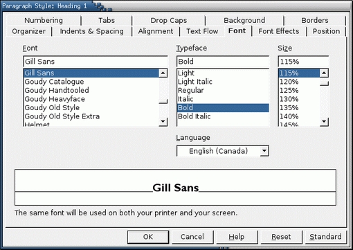
Figure 3. The starting place for fonts, the Font Tab is found in all four OpenOffice.org applications.
As the name suggests, the Regular typeface is the one most commonly used. Most of the time, therefore, you should select fonts on the basis of the Regular typeface. For on-line documents, you want a font with strokes of even thickness. Italics are used for emphasis and titles on paper. Bold typefaces usually are used on-line for the same purpose, because many italic typefaces are hard to read on-line. Increasingly, bold typefaces are used on paper, too.
One oddity of OpenOffice.org is the variation in how typefaces display. In some cases, all the typefaces belonging to the same font family display together in the font selection lists. In other cases, each typeface is listed separately, so that font lists have several entries for a single font. No one has explained fully this irregularity, but it seems to be due to how typefaces are listed in the font files themselves. Whatever the reason, be aware that you may have to search for a typeface.
Once you select the typeface, consider the font size. The size is the space given to each character and the area around it, not only the size of a character itself. For this reason, different fonts use different amounts of space, which means that fonts of the same size can have letters of a different height.
Font size is measured in points. One point is about 1/72nd of an inch. A readable font size for body text usually lies somewhere between 10-14 points, depending on the font. 8 points usually is a minimum. However, more spacing between lines (Indents and Spacing -> Line Spacing) makes a small font easier to read.
As a final step, you may want to choose the language and language locale used by the style. If the dictionaries for the language and locale are not installed in Tools -> Options -> Language Settings, or if Tools -> Spellcheck or Tools -> Hyphenate are not set to use this language, any paragraphs formatted with this style will not be checked or hyphenated.
The Font Effects tab contains the finishing touches for the font selection. Some, including relief, outline and shadow, should be used sparingly. As for the on-line blink effect, many Web designers consider it so annoying that it should not be used at all.
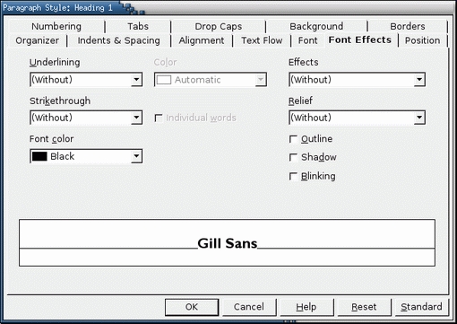
Figure 4. Available from all OpenOffice.org applicatins, the Font Effects tab customizes your fonts for different needs.
More practically, the Effects settings determines how the paragraph or selected characters are capitalized. Possible choices are:
Without: capitals are inserted as needed. In most cases, you probably want to accept this default.
Capitals: all characters in the paragraph use ordinary capitals. Use this setting sparingly. Paragraphs in all capitals are hard to read, and the on-line convention is that capitals are the same as shouting. Moreover, ordinary capitals are not designed for this use; if you need a paragraph in all capitals, use small capitals instead.
Lowercase: no characters in the paragraph are capitalized.
Title: the first letter of each word is capitalized. This setting is ideal for headings.
Small capitals: all characters in the paragraph use small capitals. Small capitals are special characters designed specifically for three or more capitals in a row. If you need a paragraph in all capitals, use small capitals instead of ordinary ones.
However, the most workaday font effect is font color. The font color should be chosen with the settings selected on the Background tab in mind. Common sense rules apply for readability: a dark font for a light background and a light font for a dark background. Light fonts on a dark background can be hard to read, especially on-line, so keep such designs brief.
In Writer, you have a third tab for setting up fonts, Position. It contains options for how fonts are positioned on the base line, the imaginary line on which characters such as m and x sit. Commonly used options are for superscript, characters that start above the baseline of other characters, and subscript, characters that start below the baseline of other characters. For both superscript and subscript characters, you can choose the percentage of the full font size by which characters are raised or lowered, plus the percentage of the full font size for the characters themselves.
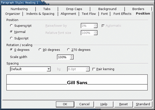
Figure 5. Found only in Writer, the Position tab customizes the display of fonts.
For more advanced users, the Position tab also includes:
Rotation/scaling: sets the angle at which text formatted by the paragraph style is at. Choices are O, 90 (at right angles) and 270 (reversed) degrees.
Scale width: adjusts the width of the space given to each character formatted by the style. This setting should be changed only by small degrees. Otherwise, the result can look unprofessional or even unreadable.
Spacing: adjusts the space between each character formatted by the style. You can select the default spacing, set by the font metrics, or you can expand or condense. More than any other option, spacing needs to be selected with care and a healthy amount of trial and error. Spacing is considered carefully by font designers, and changing it frequently proves disastrous.
Pair kerning: adjusts the spacing between certain combinations of letters to improve the general look. This setting should be selected for almost all fonts. In a few cases, however, the effect makes the spacing look worse instead of better.
This article barely introduces the subject of fonts. Hundreds of books and articles are available on the subject, and many people have made it a lifelong study. Below are two books that can teach you how to improve your design work. Both are relatively inexpensive and won't be outgrown in a hurry; you'll return to them again and again:
The Non-Designer's Design Book. 2nd. Ed. Robin Williams. Berkley, CA: Peachpit Press. 2003. A quick and entertaining introduction to design and layout, especially on a computer. Many professional designers have been introduced to design by this book.
The Elements of Typographic Style. 2nd. Ed. Robert Bringhurst. Vancouver, CAN: Hartley and Marks. 1996. One of the Bibles of modern typography. Bringhurst explains in detail the issues of design, trying hard to be reasonable and non-dogmatic in his comments. Although not as accessible as William's book, this one is more complete. Use it as an encyclopedia of design issues.
Bruce Byfield was a manager at Stormix Technologies and Progeny Linux Systems and a Contributing Editor at Maximum Linux. Away from his desktop, he listens to punk-folk music, raises parrots and runs long, painful distances of his own free will. He currently is writing a book on OpenOffice.org.
