
Building Reusable Java Widgets
There is no getting around it, if you are programming with Java, eventually you will need a specialized widget. I know, Sun Microsystems provides the Abstract Windowing Toolkit (AWT) with every download of Java; however, the AWT's small set of widgets and fairly low-level graphics will eventually leave you wanting. When it's time to wow the boss, the customer or the dog, it's time to roll up your sleeves and do it yourself.
This article examines some good techniques for extending the AWT. You will not simply learn how to create interesting widgets. You will also (and perhaps more importantly) learn how to make them reusable by employing good design practices and adhering to the AWT's architecture. To do this I will introduce some of the important concepts of the AWT's event model, hierarchy and graphics. [Perhaps the most significant change from version 1.0x to 1.1x was the shift from an inheritance-based event model to a more powerful delegation-based model.] This article will deal solely with Java version 1.1x and above, including the new event model.
I have written this article with the expectation that you have some basic experience with Java. You will need to know how to compile and run Java code to try out the examples. It would be a bonus if you have created the obligatory “Hello World” applet and are familiar with layout managers.
There is nothing Linux-specific in this article. One of Java's primary strengths is that it will run on any platform that has the Java virtual machine ported to it. Not surprisingly, Linux is one. In fact, chances are good that your version of Linux has Java compiled into the kernel. I have run these examples on various versions of Linux and Solaris 2.5. If you wish to experiment with building widgets on Linux, you will need to get a Linux port of the Java Development Kit (JDK) from Blackdown or sunsite. Of course, you will be able to run the example applets in any Java-enabled browser that runs on Linux—that would be Netscape.
If you write your GUI relying solely on the AWT, chances are pretty good that it will be ugly. While the AWT provides an excellent framework for GUI development, it was never meant to be the last word in GUI toolkits. The AWT provides a set of “least common denominator” widgets, so if you are interested in simple push buttons, sliders or text fields, the AWT has you covered. Unfortunately, modern user interfaces often call for GUI controls beyond these old standbys.
When your design requirements or creative wishes exceed the capabilities of these standard widgets, you need to create your own. When the time comes that you are ready to create your own widget, you will have choices. You could create a very uncooperative widget which is tightly coupled with your application. Or, you could choose to leverage the power of object-oriented programming, and the existing architecture of the AWT. It should be no surprise that I advocate the latter. If you agree, you will create open, reusable widgets that can be used by anyone in the Java community, regardless of his choice of operating system.
Linux users are a generally individualistic lot. Individuality has its place, but when it comes to the architecture of your widget I advocate fitting in with the crowd. When I go to the trouble of creating a widget I want to make sure that it can be used over and over painlessly. I achieve this by adhering to the design of the AWT. Although the AWT is not the most visually appealing widget toolkit, it does provide an excellent framework for widget creation and interaction. By working within the bounds of this framework we adhere to the basic architecture of the AWT and get reusable widgets.
When you design your widgets to cooperate with the existing architecture, you ensure that they are robust, maintainable and easily reusable by any Java developer (including yourself). Your widgets will be “pluggable”. Any Java user will be able to simply plug in the widget and use it like any other standard GUI componet provided in the AWT.
There are several important aspects to keep in mind when designing and creating widgets. In this section I will discuss some of these and evolve a template for widget creation.
In order to cooperate with the AWT, your widget must have Component as its ancestor. I don't mean to imply that you must subclass Component directly; here in fact, you can often inherit some useful behavior by subclassng further down the hierarchy (see Figure 1 for a portion of the Component hierarchy).

Figure 1. A Portion of the AWT's Component Hierarchy
Your widget might be drawn on the fly or created from images stored on a local or remote machine (GIFs for example). The Canvas class is a good choice for this type of component. The Canvas class provides a blank area for drawing. It will take some experience to be able to choose an appropriate superclass for your widget. It is wise to take some time to study the Component hierarchy of the AWT before choosing a superclass.
If your widget generates events, you have to stay within the bounds of Java's event model. In the “early days”, Java used a cumbersome inheritance-based event model. With the introduction of Java 1.1, the AWT sports a completely modern, delegation-based event model. The concept is simple. When a user interacts with a widget, it generates events. Objects can register an interest in all or some of these events. These interested objects, known as listeners, receive the events and take appropriate action. This process is known as delegation. Listeners are delegated by the widget to handle the events they generate.
When you create event classes, make sure they contain appropriate information and are generated in response to appropriate user actions. It can get confusing when you start to generate your own events. First, you create the event classes. Next, you create a listener interface. This interface defines methods of the listeners that will be called when an event occurs. Finally, you create an event multicaster. Event multicasters have the job of broadcasting events to many listeners. Sounds complicated, but hopefully it will become clear after an example or two. Figure 2 is a diagram of the multicasting process.

Figure 2. Event Multicaster
The appearance of your widget will not strictly affect its ability to be reused. However, a widget's appearance should be in visual harmony with the rest of your GUI. Here are some things to think about, which, while not hard and fast rules, are important.
Modern widgets produce a 3D appearance by shading. Shading is created by an imaginary light source that is positioned, by convention, at the upper left of the widget. When a button is in the raised state, its upper and left borders are brighter than the face of the button (see Figure 3). Its lower and right borders are darker. This shading makes it appear to be raised. Swap the light and dark areas, and the button will appear depressed (see Figure 4).

Figure 3. A Button in its Raised State
If your widget is drawn or has drawn areas on it, keep in mind the 3D effects are what make it as attractive as possible. And remember, drawing occurs in the paint method of your class. The AWT calls the paint method any time your widget needs to be drawn.

Figure 4. A Button in its Pressed State
There are generally two methods you can use to create reusable widgets: composition and specialization. Before continuing, let's take a moment to discuss each method.
Composition Widgets that are created by composition are sometimes called super-widgets or composite widgets. This type of widget is simply a collection of other widgets that work together to accomplish a specialized task. You should create a composite widget whenever you have a recurring task which requires a number of sub-components working together. Some examples include an order form, file dialog or a color chooser. When you create a composite widget, it is important to hide the events of all its sub-components and generate events at a higher level appropriate to the semantics of the composite widget itself. You will see how this works in the e-mail entry widget and the window-bar widget.
Sometimes a widget is required that is slightly different from a standard AWT widget. Perhaps you need to add some new behavior or look. It is in these situations that you should consider creating a widget by specialization. When you create a widget by specialization, you create a subclass and add or override existing behavior. The power of inheritance gives you all of the behavior of the superclass, so all you need to do is write the new code. An example we will discuss is the VerticalSeparator, a subclass of Canvas. It overrides the paint method to achieve its own special look. The vertical-separator is a good example of this. The collapsing pane is a more subtle example of how to use specialization.
For the sake of clarity in the examples, I have kept the graphics to a minimum and focused on the “nuts and bolts” of creating a reusable widget.
A note about style: I precede all of my instance variables with an underscore. Variables in upper case are class variables (static variables), and variables in lower case are generally temporary variables that have either been passed into the method or defined within the current block. Class and interface names always start with an upper case letter. Event classes always use “Event” as a suffix, and listener interfaces always have “Listener” for a suffix.
The first widget is a simple vertical separator. A separator should be familiar to HTML users; the <hr> tag creates a horizontal rule. Separators are used to separate groups of components. The vertical separator is a very simple widget. It does not need to interact with any other widgets or objects. It is simply a visual component. After a little thought I came to the conclusion that this widget should be created by specialization, specifically by subclassing the Canvas class. Canvas is a good choice here since the only duty of the vertical separator is to render itself on the screen. Separators generally have an etched look to them, as if they were carved into the screen.
To create the 3D effect of etching, draw two lines next to each other, one darker than the background, the other lighter. Here is a simple Java code fragment to create two vertical lines—one will appear etched, the other one raised. See Figure 5 for a picture of the two lines.
public void paint( Graphics g ) {
        // draw a raised line
        g.setColor( _light ) ;
        g.drawLine( 5, 10, 5, 40 ) ;
        g.setColor( _dark ) ;
        g.drawLine( 6, 10, 6, 40 ) ;
        // draw an etched line
        g.setColor( _dark ) ;
        g.drawLine( 25, 10, 25, 40) ;
        g.setColor( _light ) ;
        g.drawLine( 26, 10, 26, 40) ;
        }

Figure 5. Etched and Raised Lines
Here is how I set the values of the two instance variables _light and _dark :
_light = getBackground().brighter().brighter() ;
_dark  = getBackground().darker().darker() ;
Setting the values relative to the background color rather than a hard-coded color makes the code more general. These lines will appear etched and raised regardless of the background color of the region in which they appear.
The vertical separator should fill its allocated space vertically and center in its space horizontally. Within the paint method you can determine the space that has been allotted and calculate its dimensions. Here is how I did it:
size = size() ;
int length = size.height ;
int yPosition = ( size.width )/2 ;
g.setColor( dark ) ;
g.drawLine( 0, yPosition, length, yPosition ) ;
g.setColor( light ) ;
g.drawLine( 0, yPosition+1, length, yPosition+1 );
Now, there is one more critical method we need to override. Remember that I have chosen to subclass Canvas. The Canvas class provides a default size of 0x0. This means that if the widget is laid out using its default size, it will not show up. To achieve a meaningful default size, you need to override the getPrefferedSize and getMinimumSize methods. I have chosen a region of 4x8 pixels for both its preferred size and its minimum size. Why did I choose 4x8? The separator has an actual width of 2 pixels. Setting its preferred width to 4 gives it a 1 pixel buffer on each side. The preferred height of 8 pixels is somewhat arbitrary—any value greater than 0 is acceptable, just so it is visible. Remember if the separator is used properly, the layout manager will grow its height to an appropriate value regardless of the preferred height.
You can see the completed VerticalSeparator class in Listing 1. Remember, we built the vertical separator to fill the vertical space that is allocated, so be sure to place it appropriately. The east and west portions of the border layout are guaranteed to be vertical regions. If the separator is placed in either of those regions, it will grow to fill the vertical region. If you place it in the north or south regions, it will be sized to its preferred height of 8 pixels, which may not be what you want. I recommend you read up on layout managers and how they respond to a widget's need to be sized. Some completely disregard preferred sizes. You can see an applet that uses the vertical separator in Figure 6.

Figure 6. The VerticalSeparator in Action
In this example I have introduced some fundamental concepts of drawing and sizing. The goal of the vertical widget is simply to make your GUI look better. This is a noble goal, but in the next few examples we are going to look at some harder working widgets that really earn their keep. Before looking at those widgets, here are a couple of challenges.
There are a few interesting extensions you could make to this class, and I leave them to you:
Generic separator: To create a horizontal separator you might want to create a HorizontalSeparator class. But why not think about creating a single class that does both depending on how it is placed? It would need to know if it were placed in a vertical or horizontal region and render itself appropriately.
Additional features: The separator we created has a fixed width of 2 pixels and is etched. Change or extend your class to support a variable width and the option of etched, raised or flat.
The e-mail entry widget represents a simple entry form used to gather information from a user. It is a composite widget built with standard AWT components. This example widget is important in the way that it interacts with other classes. This class broadcasts customized events which can be captured by any interested object in the system. The ability to broadcast custom events to listeners of those events is critical in creating a reusable widget. The e-mail widget will have a done and cancel button. Remember, you do not want other objects to have direct access to these buttons or the events that they generate. Why? Suppose the e-mail widget changes down the line and no longer uses a button click to signify completion. Every object that uses the class will break and will have to be rewritten. If you hide these events, how can your widget notify interested parties of its changes in state? You must generate widget specific events and create listeners of these events. These events must make semantic sense to the action of the e-mail widget. We will see how this is done in a moment, but first let's create its visual appearance.
The visual layout of the e-mail entry form is created in its constructor. The widget consists of a text field, a label and two buttons.
Class EmailEntry extends Panel implements
        ActionListener {
public EmailEntry() {
        super() ;
        _doneButton = new Button( "Done" );
        _cancelButton = new Button( "Cancel" ) ;
        _emailField = new TextField( 40 ) ;
        // build a sub-panel for the buttons.
        Panel = new Panel() ;
        buttonPanel.add( _doneButton ) ;
        buttonPanel.add( _cancelButton ) ;
        // install the components in the widget
        this.setLayout( new BorderLayout() ) ;
        this.add( "West", new Label(
                "Enter your e-mail address"));
        this.add( "Center", _emailField) ;
        this.add( "South", buttonPanel ) ;
        // forward events to myself
        _doneButton.addActionListener( this ) ;
        _cancelButton.addActionListener( this )
        }
}
Notice that in the widget subclasses Panel, I chose panel as the superclass so that I can inherit its layout capabilities. Also notice the class implements the ActionListener interface. This means that the class is allowed to listen to action events (the events that are generated by buttons). Toward the end of the constructor the class registers itself (in the call to addActionListener) as a listener of both push buttons.
You must determine the events that your widget will generate. I have chosen to create a single event class, the EmailEntryEvent that can represent either “user is done” or “user canceled” state. When you create your event class keep in mind that it must maintain sufficient information to act on the event. In this example the event must store the e-mail address that was entered. Listing 2 shows the EmailEntryEvent class. Notice that I have created two constructors. When the constructor is passed an e-mail string, an e-mail entry event of type done is created. If no information is passed to the constructor, an event of type cancel is created. The e-mail entry widget has the responsibility of invoking the proper constructor (a reasonable request of the widget).
When an event is broadcast to a listener, specific methods of the listener class are invoked. You might think of these as “callbacks”. The listener interface defines these methods. The interface ensures that any class intended to be a listener has the methods needed to handle the event. The e-mail entry listener interface is shown in Listing 3. Any class that wishes to be a listener of EmailEntryEvents is required to implement a done method and a cancel method.
Event multicasters handle asynchronous broadcasting of events to listeners. You will be relieved to know that you do not have to write your own multicaster from scratch. Instead you will need to create a subclass of the existing AWTEventMulticaster and write a few methods so that it can handle your new events. When you create your multicaster follow these steps:
Implement the listener interface that you created in Listing 3.
Create the add and remove methods using that same listener.
Create the methods defined in the listener interface. These methods simply forward the messages to the appropriate listeners.
Take a look at Listing 4 to see how I created the multicaster for this example. Don't let the multicaster scare you. The code is very basic, cookie-cutter-style. You will be relying on the superclass to do all of the hard multicasting work. All that your multicaster must do is be aware of your new events and listeners.
We have now created all of the necessary components,, and what remains is to connect it up properly. The first order of business is to complete the EmailWidget class. As we left it, it only had a constructor. Next you must give it the ability to add listeners. Here is the addEmailEntryEventListener method:
public void addEmailEntryListener(
        EmailEntryListener e ) {
_emailEntryListener = MyMulticaster.add(
        _emailEntryListener, e ) ;
}
Notice that the widget has an instance variable that maintains its listener. If you look closely, you will see that this variable is actually an instance of your multicaster class. Any widget can potentially have many listeners. Your multicaster will maintain the list of listeners and ensure that they get their appropriate events. Finally, you must handle the internal events (from the buttons) and generate your new event.
public void actionPerformed( ActionEvent e ) {
        EmailEntryEvent newEvent ;
        if ( _emailEntryListener == null ) return ;
        if ( e.getSource() == _doneButton ) {
                newEvent = new EmailEntryEvent(
                                getEmailAddress()) ;
        _emailEntryListener.done( newEvent );
    }
        else if ( e.getSource() == _cancelButton ) {
                newEvent = new EmailEntryEvent() ;
                _emailEntryListener.cancel( newEvent );
    }
In this code you generate the widget specific events. When the
done button is pressed, a “done” event is
created that stores the e-mail address. Otherwise a “cancel”
event is generated. Notice also how the event is dispatched: the
corresponding method is called on the multicaster
(_emailEntryListener is an instance of
MyMulticaster). The multicaster then forwards
the method call to all of the registered listeners. The EmailEntry
widget is now ready to be used by any Java program.
Listing 5 shows a simple applet
that uses the e-mail entry widget and intercepts the events. Take a
look at the e-mail entry widget in Figure 7.

Figure 7. The EmailEntryWidget in Use as an Applet
One important note: the e-mail entry class generates a done event. How is this different from the action event generated by the done button? The difference is subtle, but important. If you rely upon detecting the events of a specific button, other classes need to know the details of the inner workings of your class. If this changes, every class that uses it has to change as well.
Here are a few ideas for expanding the EmailEntry widget that you might enjoy trying:
Collect more information: Expand the widget by collecting more information from the user. Add checkboxes, additional text fields and so on. Remember that your event class has to maintain this information and pass it on to the listeners.
Add error checking: Check for things like the e-mail address being complete and reasonable. Be sure that you are broadcasting the event only if the form is completed correctly.
The window bar is a component needed for the collapsing pane example below. You click on the window bar and the pane collapses. Click on it again and it opens up. To keep it simple I will use a button for the bar, rather than creating a fancy visual bar. The bar must broadcast events to signal that the pane should collapse or restore.
The layout of this widget is intentionally trivial, to keep the example simple.
public WindowBar() {
        super() ;
        _closer = new Button( "Collapse" ) ;
        _closer.addActionListener( this ) ;
        add( _closer ) ;
}
For this widget we need an event with states of “collapse” and “restore”. This will be very similar to our e-mail entry widget. Here is the PaneSwitchEvent:
class PaneSwitchEvent extend AWTEvent
{
  public static final int COLLAPSE = 1 ;
  public static final int
  RESTORE =2 ; private int _type ;
  public PaneSwitchEvent( Object source, int t )
  {
        super( source , 0 ) ; _type = t ;
  }
  public boolean isRestore()
  {
        return _type == RESTORE ;
  }
}
The pane switch event needs only to maintain the type of event that it represents.
Let's continue down a familiar road and look at the PaneSwitchEventListener. Here it is:
interface PaneSwitchListener extends EventListener
{
  public void restore( PaneSwitchEvent e ) ;
  public void collapse( PaneSwitchEvent e ) ;
}
Your listener defines the two methods invoked when the pane switch event occurs. In this case it is restore and collapse.
The multicaster is very similar as well. Just as in the e-mail example, you must create the add and remove methods that accept pane switch listeners as arguments. Then create the collapse and restore methods. Note that you do not need to create a new multicaster for each event class you create. You may choose to have a single multicaster class for all of your widgets. I have chosen to combine the events from both examples into one multicaster class. See Listing 4 for details.
Finally, we need to complete the WindowBar widget. This widget will simply change its text from “collapse” to “restore” and back again when clicked. In addition it sends the corresponding event. Take a look at Listing 6 to see how it's done.
A visual window bar: Create a subclass of WindowBar that renders itself graphically, instead of as a button. Read up on mouse listeners and mouse events; you will need to listen for them.
A more complete window bar: Consider additional actions such as maximize, close, etc. What classes change and in what way?
The collapsing pane widget is a container containing exactly one component. It provides a window bar across the top, and the contained component takes up the rest of the area. When the bar is clicked, the widget collapses to display just the window bar. When the bar is clicked again, the component is restored. This widget does not need to generate events. However, it does need to listen for events from the window bar and take action based on them.
The CollapsingPane class is a subclass of Panel. I install BorderLayout as its layout manager. The component that will be collapsible is installed in the center area, and the window bar is installed in the north.
class CollapsingPane extends Panel implements
        SwitchPaneListener {
        public CollapsingPane( Component c ) {
                setLayout( new BorderLayout() ) ;
                WindowBar bar = new WindowBar() ;
                add( "North", bar ) ;
                add( "Center", c ) ;
                bar.addCollapseListener( this ) ;
        }
}
This class does not generate events, but it must handle them. It is listening for switch pane events. When it receives a collapse event it must collapse, and restore itself upon reception of the restore event. We have seen how to listen for events and trap them (take a look at the collapse and restore methods in Listing 7). Now, let's look at what to do when we receive the event. In particular, how do you go about collapsing a component? Every component in the AWT can have its visibility set true or false. But simply setting its visibility is not enough; you must also re-compute the layout and redisplay the parent component. Here is how I did it:
private void redraw() {
        Component x = _containedComponent ;
         while( x.getParent() != null )
                {
                x = x.getParent() ;
                }
        x.validate() ;
        x.repaint() ;
}
This method simply searches up the component tree until it finds the top window (your applet most likely, but it could be a free-floating window or an application frame). Once the topmost window is found, I ask it to validate. This will cause the layout to be re-computed (items that are not visible will not be included) and re-displayed. An example of the collapsing pane widget is shown in Figure 8. This example uses the e-mail entry widget as the component that is collapsed.
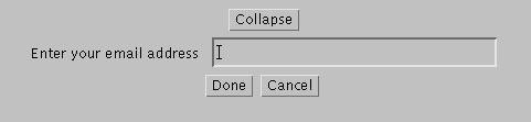
Figure 8. CollapsingPane Widget Used in an Applet
Modify the class to accept any arbitrary window bar. You can do this by adding a method to set the window bar or create a new constructor. Remember that in order for the class to the work, the window bar you install must be a subclass of WindowBar. Also, you might think of a way to remove that restriction using interfaces.
We have discussed techniques for designing Java Widgets that are reusable. The resulting widgets are powerful and pluggable enough to warrant the extra effort involved. This article is a starting point, and I encourage you to explore and experiment with new and innovative ideas for your own widgets. I have chosen to focus on the capabilities and design goals. I strongly recommend that you extend these widgets to give them visual “punch”.
You can download all of the examples from this article from Linux Journal's FTP site (see Resources) or from the Harris web site at http://www.hisd.harris.com/Capabilities/java/. At the Harris web site you will be able to see the applets in action and explore some more advanced iterations of similar widgets.