OOo Off the Wall: Building Characters
Character styles are a set of formatting options applied to selected text. They are a basic tool in most word processors, and OpenOffice.org's use of character styles is more or less typical. If you have used character styles in other word processors, then you probably can grasp the basics of using them in OpenOffice.org with few difficulties.
If you are a newcomer to styles, imagine that you decide to put the title of a book in italics. You could enter an override by selecting the italics icon on the Function bar. However, you can work more efficiently if you create a character style for italics or book titles, and apply the style instead. That way, if you decide that all the book titles in your document should use a bold regular weight instead of italics, you can update them simultaneously by modifying the style.
As with other word processors' character styles, OpenOffice.org's work closely with paragraph styles. That is, the basic font of a character style usually is chosen to match or contrast with a particular paragraph style's font. Often, too, the character style differs from the paragraph style only in the font effect, position or background it uses. In fact, you can think of character styles as a style-based override of a paragraph. But no matter how you think about them, character and paragraph styles are a matched pair, by far the most widely used styles in OpenOffice.org.
What is less obvious and more unusual is that many character styles play important roles in the automatic functions of OpenOffice.org Writer, as well as in the export to other formats. Without these character styles working in the background, much of the convenience of Writer would be lost.
How do character styles work in Writer? How can you get the most out of them? When you know the answers to these questions, you'll start to understand the power of using styles to format your work.
Character styles in OpenOffice.org have several characteristics that you should be aware of when using them:
Character styles do not have a Next Style field on the Organizer tab. Character styles generally are applied to selected text in paragraphs otherwise formatted with a paragraph style. Under this circumstance, specifying the next style makes no sense.
Unlike paragraph styles, character styles have a limited number of views available from the drop-down list in the stylist: All, Applied Styles, Custom and Hierarchical.
Character styles in OpenOffice.org are not cumulative, as they are in some word processors. In other words, you cannot apply the Emphasis character style followed by the Internet Link character style to get a format that combines the features of both. If you try, all you do is change the format of the selected text from Emphasis to Internet Link. Instead, you need to create a third character style that combines the characters of both. The quickest way to do this would be to create a new character style based on one of the styles and then modify it to use the features you want from the second style.
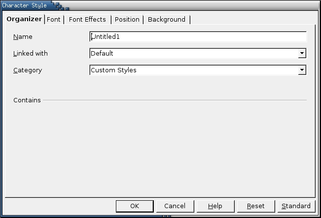
The window for designing a new character style. Character styles can be hierarchial, so the Linked with field is available. However, there rarely are used one after another, so there's no Next Style setting.
Every now and then, people on the OpenOffice.org users' list asks why so many styles are pre-defined. They would rather define their own styles, they say, and grow peevish when they find that they can't delete the pre-defined ones. However, set the Stylist to the All View and select the Character Style button, and you'll soon understand why the pre-defined styles exist and are undeletable.
To start with, many character styles are used automatically by OpenOffice.org, even though you might not be aware of the fact. For example, the Bullet style is used for unordered lists and the Numbering Symbol style for ordered lists. Similarly, Line Number is used whenever you select Tools -> Line Numbering, and Page Number is used when you select Insert -> Fields > Page Number. And, when URL Recognition is chosen from Tools -> AutoCorrect/AutoFormat -> Options, Writer automatically uses the Internet and Visited Internet Link character styles when appropriate. You don't need much reflection to realize that if such character styles were deletable, an anal-retentive user could cripple Writer in the name of tidiness.
Less obviously, many pre-defined character styles also are mapped to HTML, XHTML and/or XML tags. For example, the Emphasis character style maps to the em tag and the Strong Emphasis style to the strong tag. Other tags mapped to markup languages include Definition (dfn), Example (sample), Quotation (cite) and Source Text (code). You could export to a markup language without these styles, but the code would be dependent on a style sheet and considerably less clean.
Customizing the pre-defined styles, of course, is another matter. Because they are used automatically, you can format them and forget about them. What if you prefer not to look at them at all? Make your own character styles, and select the Custom Styles view in the Stylist. The predefined styles continue to be applied in the background and are updated by any changes made to your default paragraph fonts.
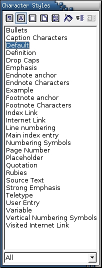
Writer comes with pre-defined character styles. These styles are not only for users' convenience. Most are used automatically by Writer, which is why you can't delete them.
For many users, customizing the pre-defined styles is all that is necessary. In particular, if you are planning to export to MS Office format, you might want to change the font used by the Bulleted style. By default, Bulleted uses the StarSymbol font to create bullets, while MS Office uses MS Symbol. Because of this difference, bullets often don't translate between the two office suites. If you create a document for export that uses another font that Windows has access to, such as Times New Roman, you can avoid this problem.
In addition, the pre-defined character styles do not include several styles that would be useful to many users, such as a superscript or a small capital style. Depending on your needs, you might want to create styles based on any of the other options on the Font Effects, Position or Background tabs. Don't forget, though, that only one character style can be applied per selected text block.
As an alternative to character styles, you might consider altering paragraph styles using conditions. Available only for styles and not for manual formatting, conditions are not a substitute for character styles in the middle of a paragraph. However, they are useful replacements for headings or other short paragraphs, such as table headers or a paragraph set up for outline numbering. Conditions and outline numbering will be discussed in future columns.
Character styles largely are selections of fonts and font settings. Unlike FrameMaker, character styles in Writer have no convenient As Is setting for borrowing attributes from the paragraph in which they are applied. Because of this lack, you cannot create a single character style for italics and use it for both body text and a heading paragraph style of a much larger size. Instead, you have to create individual character styles for both the body text and heading paragraph style. The exception is the Default character style, which returns the selected text to the attributes set in the paragraph style.
Most of the time, the character style should be the same size as the font for the paragraph style in which it is used. Otherwise, line spacing is affected for any line on which the character style is used. The easiest way to ensure that the size is the same is to use the same font, but in another typeface.
If you do use another font, don't be surprised if it looks bigger or smaller than the paragraph font even though it is the same size. Remember that a font's size denotes the amount of vertical height given to characters, including the empty space around the actual letters. If one font uses more space around the letters, then the letters that use the font will be smaller than letters in another font of the same size.
Remember, too, that as with other sorts of design, parsimony is essential to successful type layout. Only a few years ago, amateur designers--especially the writers of technical manuals--tended to overdose on the options offered by digital type and used as many as a dozen different character styles in a single document. Some technical manuals would use six or eight different character styles: one for commands to enter, one for menu items, one for new terms and so on. Not only was the result a cluttered page, but the conventions nearly were impossible for readers to remember. Mercifully, this type of overkill has become rarer as people learned to take the options for granted. Today, far fewer character styles are used in most cases.
Two conventions that have not died are the tendencies to use bold weights everywhere and to use a monospaced font such as Courier for commands. Too frequent use of bold weights makes a page look like a pimply teenager suffering an outbreak of blackheads. Nor is the appearance helped by the fact that, in many word processors, bold weights are simply thickened versions of the regular typeface rather than fonts specifically designed to accommodate the thickness of the letters. This appearance is especially common in word processors that cobble together bold characters on their own rather than using the typefaces that come with the font. Fortunately, OpenOffice.org does not create its own bold weights; if a font lacks a bold weight then the regular typeface is used instead. Still, the over-use of a bold weight is a problem even in OpenOffice.org. A better solution in a paper document is to use italics. On-line, try using the same font as for headings, headers and footers. Because the font is being used already, the result usually is a more aesthetic page. Often, too, in any media, you can replace any character style with a word in the paragraph's main font, referring to the File menu rather than the File menu.
Similarly, the habit of formatting computer commands in a monospaced font has more tradition behind it than thoughtful design. True, command lines tend to look better with a monospaced font, especially when arranging text in columns, as in the output returned for the cal command. Yet that is no reason that a document has to do the same. The fact that the most readily available monospaced fonts, such as Courier and Franklin Gothic, are plain ugly makes the practice even less desirable. Better monospaced fonts do exist (for instance, see www.ragnarokpress.com/scriptorium/monospaced.html), but they are rare, and you should be prepared to pay for most of them.
If you have never used styles before, then character styles are a good place to start. The application of character styles are straightforward, and the time save is a benefit that anyone can appreciate. Once you feel comfortable with character styles in Writer, you will be ready to use Outline styles in Impress or Cell styles in Calc, both of which are near equivalents. You'll also be ready to consider paragraph styles, the other workday styles on which character styles depend.
Bruce Byfield was a manager at Stormix Technologies and Progeny Linux Systems and a Contributing Editor at Maximum Linux. Away from his desktop, he listens to punk-folk music, raises parrots and runs long, painful distances of his own free will. He currently is writing a book on OpenOffice.org.